Hey, my name is Jake Robers. I am currently studying abroad in the Czech Republic. While I am enjoying Prauge, I will also be learning about machine learning through a free course on Udacity. I will paraphrase what I have learned, and give some additional examples to reinforce the lessons. The goal is to deliver a blog post every week so that I can document my journey in machine learning – Enjoy!
Machine learning aims to solve challenging problems with relatively easy mathematical operations. When pairing these mathematical operations with large datasets, we can discover generalized equations. Furthermore when the general equation is applied to additional input values, we can determine accurate outputs.
Terminology
Before diving into the introductory theory of machine learning, let’s define a few important concepts.
Supervised Learning – Teaching a machine proper outputs given corresponding inputs by providing a plethora of examples.
Feature – Features are the aspects, properties, or attributes that should be considered when conducting supervised learning. These are your input values.
Labels – Labels are the classifications made based on the features. Labels are your output values. One example of a label is Amazon’s product suggestion on their homepage. In a simple system, there would be two labels: “Yes”, suggest the customer this product. “No”, do not suggest the customer this product.
Classifier – An object that can learn from datasets and make conclusions for subsequent input values.
Data Quality
One important idea to keep in mind is that your results will only be as good as the data you use. If the system is given bad data, then you will also receive a bad classifier. Therefore, any additional test data you provide the system will result in inaccurate output values. This is similar to teaching a young child improper grammar – they can only speak as well as they are taught.
Another important notion is to never test your classifier with the same data you train with. This would be similar to going to the orthodontist to get braces, but never getting them tightened. Without the braces adjustment, you will never receive the expected results.
Scatterplots
The one effective way to visualize the data that we are working with is through scatterplot diagrams.
Interested vs Uninterested
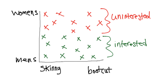
Consider an Amazon example: a customer is browsing for clothes and we are trying to optimize their shopping experience by recommending similar styles. Let’s say that this customer is looking for a new pair of jeans, and we want to determine which jeans they like. Finally, let’s assume that any pair of jeans that they add to their wish list are “interesting”, while any other pair they browse are “uninteresting”.

Some assumptions that we can observe from the graph above is that this customer is interested in mens’ jeans, and they do not have a preference for skinny or bootcut style.
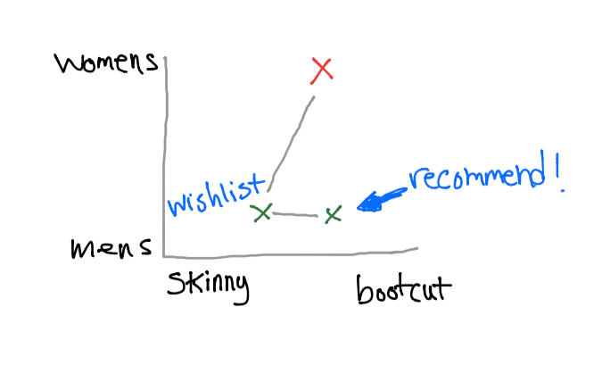
Now, we can fetch mens’ jeans from our database and recommend these results to the user.
Now, you’re probably thinking “there are definitely many other attributes that a pair of jeans has. Can’t we also classify through these features?” The answer is YES! If we can develop a list of features that describes a pair of jeans, then we can narrow down the recommendations to what the customer actually wants.
Some possible features for jeans could be:
- bleached
- shade
- color
- price
- women/men
- adult/children
- cut
If we were to create a scatterplot graph of 7 dimensions (one for each attribute), then we could represent all of these features. So next time a customer adds a pair of jeans to their wish list, we can recommend jeans that are very similar to the one chosen.
So how do we know if a pair of jeans is similar to the one that is chosen? When we generate the 7-dimension graph is created, we simply recommend the vector that is closest to the vector added to the wish list.

Unclear Results
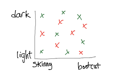
Consider classifying jeans with only two attributes: shade and cut.

If the interested/uninterested points are scattered randomly, then we cannot use this graph to recommend new jeans to the customer. Before running machine learning algorithms on a dataset, it may be beneficial to graphically represent the dataset first. This could save some time in the long run.
Decision Surface
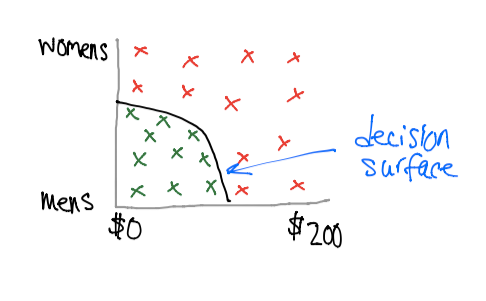
Suppose we want to compare against price and gender.

It appears that the customer is only interested in mens’ jeans that are below $100. The threshold that classifies interesting jeans is called the decision surface.
Using computer algorithms, we will be able to generate this decision surface by giving it training data. The first algorithm uses a Naive Bayes approach.
SKlearn
In this example, we will be training on a dataset and then making predictions based on additional test data. Sklearn is a framework built on python for machine learning.
from sklearn.naive_bayes import GaussianNB
def predict(train_features, train_labels, test_features):
  clf = GaussianNB()
  clf.fit(train_features, train_labels)
  return clf.predict(test_features)
The above function will provide a “best guess” for test_features based on the training data. We can also take this one step further and determine the accuracy of our algorithm if we know the output of the test features. We will call this test_labels.
from sklearn.naive_bayes import GaussianNB
def accuracy(train_features, train_labels, test_features, test_labels):
  clf = GaussianNB()
  clf.fit(train_features, train_labels)
  return clf.score(test_features, test_labels)
Conclusion
It is quite beneficial to represent your data on a scatterplot graph because it allows you to visualize the problem you are working with before implementing a machine learning solution. Remember that features are the inputs, while labels are the outputs and that your classifier will only be as accurate as the data that you provide it.